color
If you ever took an art class when you were in school, you probably talked a lot about color. You may have taken colors and mixed them together to learn that two colors mixed can make an entire new color. Mixing red and yellow makes orange, combining blue and yellow makes green, and mixing red and blue makes purple. Adding white to any color lightens it, such as adding white to red to make pink. We see color all throughout our world every day. There are cool colors such as blue, green, and purple. There are warm colors including red, yellow, and orange. There are complimentary colors that are opposite of each other on the color wheel such as red and green, blue and orange, and purple and yellow. There is so much that we can learn about color.
According to Berdan (2004), the vocabulary of colors includes hue (referring to the primary colors), value (lightness and darkness of color), intensity (saturation of color), monochromatic color (only one color is used but its value changes), and analogous colors (colors adjacent to each other on the color wheel). When I was searching for the perfect colors to include in my photographs, I considered all of these. I searched for warm colors and cool colors, monochromatic colors and analogous colors. I found colors in the outside world and right inside of my house, but my favorite colors are the one that occur naturally in nature. This page showcases my favorite photographs that exude the element of color. The header image is actually a close-up shot of one of my daughter's leotards. The colors really stand out in this image. The first showcase image is of the view of green from my back porch, which is a monochromatic picture. The next image is some beautiful fuchsia flowers that's colors really pop to the eye. The third image is from a low country boil. The colors of the food, especially the bright yellow corn, really stand out. The last photo is of some orange and yellow flowers. Orange and yellow are analogous colors, and the green of the plant really makes these two colors pop.
According to Berdan (2004), the vocabulary of colors includes hue (referring to the primary colors), value (lightness and darkness of color), intensity (saturation of color), monochromatic color (only one color is used but its value changes), and analogous colors (colors adjacent to each other on the color wheel). When I was searching for the perfect colors to include in my photographs, I considered all of these. I searched for warm colors and cool colors, monochromatic colors and analogous colors. I found colors in the outside world and right inside of my house, but my favorite colors are the one that occur naturally in nature. This page showcases my favorite photographs that exude the element of color. The header image is actually a close-up shot of one of my daughter's leotards. The colors really stand out in this image. The first showcase image is of the view of green from my back porch, which is a monochromatic picture. The next image is some beautiful fuchsia flowers that's colors really pop to the eye. The third image is from a low country boil. The colors of the food, especially the bright yellow corn, really stand out. The last photo is of some orange and yellow flowers. Orange and yellow are analogous colors, and the green of the plant really makes these two colors pop.
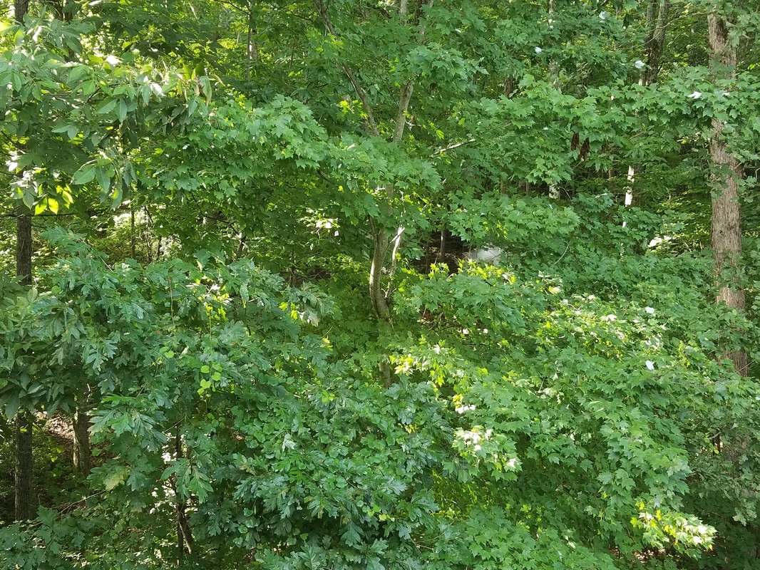
Title: View of Green from my Back Porch
Date Taken: August 20, 2016 Time of Day: Mid-Morning (8-11) Camera Used: Samsung Galaxy S7 Edge Phone Flash Used: N |
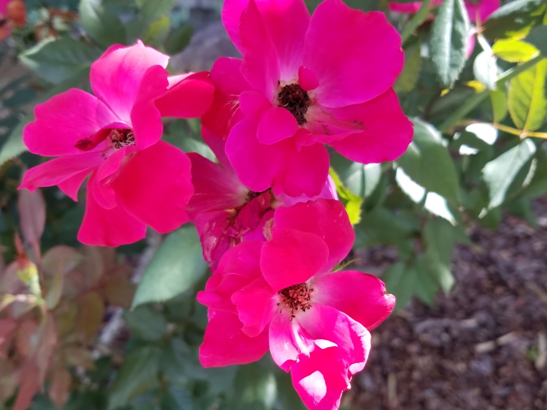
Title: Fuchsia Flowers
Date Taken: August 20, 2016 Time of Day: Late Afternoon (4-6) Camera Used: Samsung Galaxy S7 Edge Phone Flash Used: N |
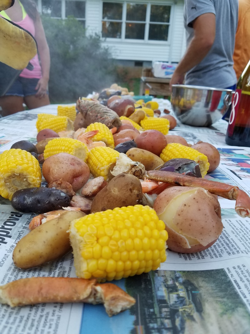
Title: Low Country Boil
Date Taken: August 13, 2016 Time of Day: Evening (After 6) Camera Used: Samsung Galaxy S7 Edge Flash Used: N |
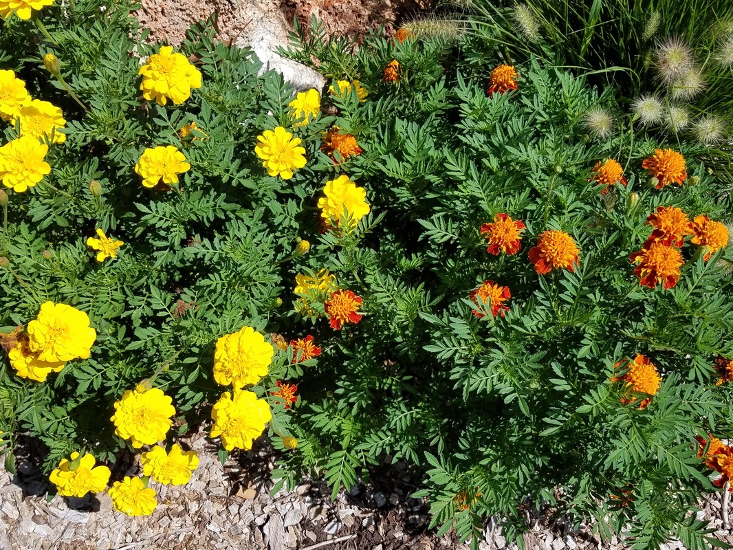
Title: Yellow and Orange on Green
Date Taken: August 20, 2016 Time of Day: Late Afternoon (4-6) Camera Used: Samsung Galaxy S7 Edge Phone Flash Used: N |
References
Berdan, R. (2004, October 1). Composition and the Elements of Visual Design. Retrieved
from: http://photoinf.com/General/Robert_Berdan/Composition_and_the_Elements_of_Visual_Design.htm
Berdan, R. (2004, October 1). Composition and the Elements of Visual Design. Retrieved
from: http://photoinf.com/General/Robert_Berdan/Composition_and_the_Elements_of_Visual_Design.htm
